Start Menu Improvements in Windows 10 Anniversary Update
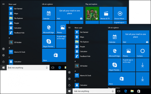
The Anniversary Update continues to build on the improvements by providing more balance for users on a 2 in 1 Surface or other Tabet. Start feels right at home whether you’re using Touch or a Mouse/Trackpad to interact with the menu system. Tablet mode, which activates a full-screen Start menu is still around but is starting to feel a bit redundant. Personally, not a fan (as you can tell…) Launching the Start menu in the Windows 10 Anniversary Update; the first thing you will notice is the All Apps menu has been dropped and instead defaults to display your application library. I agree with the change, after all, when you open Start, your intention is to launch an app; the new update makes it a little easier and saves a click.
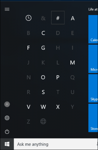
The alphabetical ordering of the application library features minor improvements too; the number filter has been replaced by a pound key. Although these improvements won’t mean much to power users, for the novice or intermediate, they will make navigating the menu feel less jarring.
The search box is one of the common ways users launch apps in Windows 10. The Instant Search function, which integrates with Cortana Search, adds quick filters at the bottom for different areas of the system such as apps, settings, documents, folders, music, video and the web. Previously, these options were buried under My Stuff.
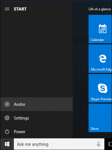
The Start menu itself is structured differently, power options, frequently accessed folders, and your user profile has been relocated and consolidated to buttons at the bottom left. A hamburger menu has been added to make it easy to select, but also provide detail of each function.
Customizing the Start menu feels less rigid, users can now resize the Start menu on the fly horizontally. Previously, showing more tiles, required accessing Settings > Personalization.
Overall, the improvements are minor but welcome. The Start menu feels much faster when launching. If you use Windows 10 on a tablet device such as a Surface Pro, the Windows 8 style Start screen will be less of a need. It would have been nice if Microsoft added an option to hide all UWP apps on the Start. Currently, the only way you can do so is by manually unpinning each app, one by one. If you missed it, check out our full review / screenshot tour of working with Windows 10 Anniversary Update in Tablet Mode. What do you think, have you gotten accustomed to the new Start menu since upgrading to Windows 10? Users still running Windows 7 or Windows 8, are any of the improvements mentioned enticing enough to make you switch? Let us know in in the comments or join the discussion in our new gP Windows 10 Forum. I have been using Windows 10 for a while now, and am currently trying to get all of my family’s Windows 7 and 8.x PC’s Laptops and Tablets upgraded before next Friday. Joy joy. Anyway, you asked how we felt about the current Start Menu. I am using the November build on 2 of my laptops, and personally I think is not too shabby. I can find everything I look for with either a click or a quick type in the Cortana search box. I don’t mind the tiles, as they are un-pinable and easy to pin new apps. I still clog my task bar with my most frequently used apps, though I know this is not necessary. I’m not totally happy with the new windows update, as you can’t select which updates you want to download now and which you’d rather hold off on, say over night for example. I think overall the OS is by far quicker and uses resources more efficiently. I play older games that take up a lot of resources, that came out when Windows 7 was the OS to have, but these games run so much smoother, and with less headaches, on my laptop, than they did on my Windows 7 Gaming rig. Truth be told, I am impressed. Which is why I’m trying to get as much downloaded on my equipment before time, and my bandwidth allotment runs out! Thank you for your insider’s look at the Anniversary Update. Min. James Gray Just like James Gray mentions above, I have had very few noticeable problems or negative experiences since the first release of Windows 10. My major issue is also the lack of choices with the updates. Each update costs me a fortune on HDD space resulting in the fact that I constantly have to add new memory at a rather hefty price in order to store unwanted stuff, or I have to remove some of my precious software. I’d like to see improvements on basic disc management, like a partitioner for one, and notification just before the upgrades. Each time after an upgrade I’m always pleasantly surprised to find some of my software having been de-activated, and then I cannot use the software until I’ve received a new registration code (which sometimes takes a fairly long time for response) as the majority of my software need manual de-activation in order to be re-activated. It would also be nice to have a built-in password vault that also works off-line. Not all computers are online all the time. And finally, the annoying adds for specials that constantly show up at the bottom-right of my screen. I have clicked about a million times on the gear to change the settings, but as soon as I close it after a change, I find these money-beggars all too happily stealing my work space. Other than that – blessed be Windows 10. Now I have to ask the question. WHY DID THEY GO AND CHANGE SOMETHING THAT WASN’T BROKEN?!!?!?! They’ve taken something that worked and was simple to understand to something that cannot be customized and is honestly a pain in the a$$ unless you download and use a 3rd party software to change it. Why didn’t they make it 100% customize-able to what YOU as the user wants to see and use instead of forcing people to use Microsoft’s new look and feel. Microsoft takes 1 step forward and 2 steps back with their update I say, Microsoft says “We’ve listen to the end users and understand what they want with windows 10”. I will be using the 3rd party SW called Classic View to resolve this issue for my family since Microsoft clearly doesn’t understand what I as the user wants to see and use. Comment Name * Email *
Δ Save my name and email and send me emails as new comments are made to this post.


