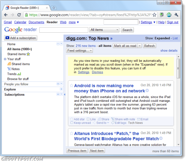
The screenshot below is the good ole’ Google Reader layout. It doesn’t have any fancy bells and whistles, but it sure does get the job done. There are a ton of options and it lets you quickly sort through and read your subscriptions, but where is the fun in that?
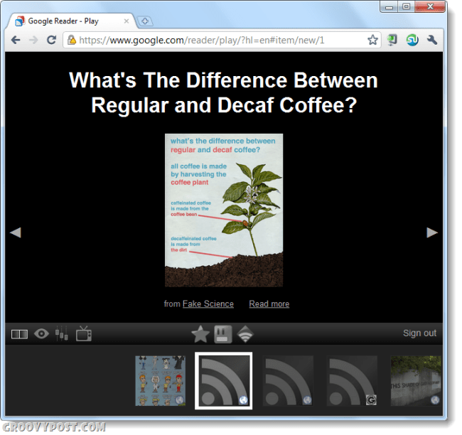
Here is where Google Reader’s “Play” comes in. It is a jet black background with auto-sized RSS feed content over the middle. Below is a queue and interface that let you navigate, if you can call it that. I imagine this feature was rolled out in anticipation of Google TV, I can’t see people using the old interface on their Television, but this one would work beautifully.
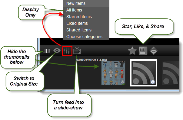
What are the Google Reader “Play” controls?
Okay, maybe I am treating this a little like a video game – but just look at all those buttons on that navigation bar! If you Hover the mouse over each one an Alt tag will appear that tells you what it does, but even that isn’t very specific. Here’s what each control does in order from left to right.
If you have Google TV, we’d love to hear what you think of the new Google Reader “Play’ feature. It is also great for people Comment Name * Email *
Δ Save my name and email and send me emails as new comments are made to this post.


