1. Widescreen is Standard
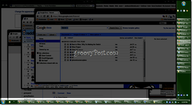
Do you remember when standard monitors had aspect ratios of 4:3? Pepperidge Farm remembers. But anyone born in the new millennium might not. Today’s monitors are 16:9 widescreen, even on dinky netbooks like my EEEPC. What that means is that you have more screen real estate fat-wise than you do tall-wise. Especially when you consider that we scroll up and down web pages, not left and right. So, sticking the taskbar on the left or right is a more efficient use of space, since you won’t be squishing things vertically.
2. Most Applications Don’t Take Up All The Horizontal Space
In spite of the hardware switch from 4:3 to 16:9, most everyday applications favor tall and skinny views. For example, Microsoft Word. In Print Layout, it conjures up an 8×11 sheet of paper, leaving a sizeable amount of empty space on either side of the workspace.
Likewise, web designs usually err on the side of lower x-axis resolutions to allow smaller screens to see the whole page without scrolling horizontally. If you are on a regular desktop, your resolution will probably be plenty big. All of this adds up to extra space on the left and right for your taskbar.
3. You Can Fit More Stuff In
When your taskbar is along the bottom, it usually takes up just one line. But because of the ample space on the side, you can bump it up to two or three columns. This means that you can see more icons in your system tray and your quick launch bar. Also, your running task buttons are all of a uniform height and width, instead of scaling based on how many are open. Personally, I feel that’s tidier.
4. You’ll Like It
Trust me, you will. I’ve been a right-hand side taskbar guy since 2006 when I saw a co-worker doing it on his computer and I’ve never gone back. Other than the above reasons, I can’t really explain why it works out so much better for me. But it does. Try it for a week and see if you agree. In fact, “Always combine, hide labels” is the default in Windows 7. In your screenshots, however, the user has reverted back to the old Windows XP way of doing things, which, in defense of your article, did need the side-mounted task bar to function better. far more than windows 7 does. I often wonder why people immediately switch off all the new innovations and options after upgrading software/operating systems, only to complain later — I see this all the time in my line of Tech Support work. As for left or right side. I prefer left because most windows have menus that have most accessed options on the upper left anyway, so less dragging the cursor all the way across a monitor if the taskbar was on the right and most accessed menu & toolbars are in the upper left. Also less interference with accidental clicking the scrollbar or close button in windows. Finally I find that I can shrink the width of the vertical taskbar to about the width of the start button, it’ll show the icon and 1st letter of the window title. Which is enough of a cue to what the window is about. No need to take up extra space for title. It’s funny now that I’ve become used to it there is no way I could ever go back to putting it back on the bottom especially since I have such a huge widescreen monitor (2 of them in fact). Readers should give it a shot for a week and see how it goes. You can always move it back if you don’t like it. ;) First of all – thank you for sharing. Sorry for rather stupid question – very often I need to send a URL for a specific article down to my clients/users/friends, however I could not find any easy way of doing this, other than copying and altering a long URL I get when I click on URL from my email. For example the url for this specific post I got is the following: https://www.groovypost.com/howto/groovytip/vertical-vs-horizontal-windows-taskbar-22947/?utm_source=feedburner&utm_medium=feed&utm_campaign=Feed%3A+groovypost+%28groovyPost.com%29 Of course I can strip out feedburner stuff… but can for example “Title” be made a clickable, plain and simple backtrack URL? Thank you Now that I use the mouse wheel however, might try it again on the right. Widescreen is standard? I still use a 15 inch monitor set to 1024 x 768. I set the taskbar to group similar items. All the applications that I use take up all the horizontal space. I rather have the taskbar on the bottom because I am familiar with the taskbar at the bottom. @general topic switching between right and left and cant really decide xD http://i.imgur.com/w1AFny7.png Good to know I’m not the only one. I keep my taskbar on the left side on my Win7 system at work and on the right side on my Win10 system at home. The only problem I have with it: On the Win7 system at work, new windows are often obscured by the taskbar (which occupies the first 62 columns of pixels on the left side on my screen). So the left position of “0” still starts at the left side of the screen, instead of starting where the taskbar ends. Regards Meaning they logically connect at the transition + Option “show WIndows on main taskbar + where its opened” Only tested for a week but feels good (I’m right-handed & a gamer, found this option easier to avoid accidentally bumping with mouse which expands it if in auto-hide mode like i have set to…so can play a game not in full screen mode while simultaneously watching video to the left of that! Lol). And the person who services our devices always moves it back to bottom during…like ‘Why on earth do you keep your taskbar ‘there’??’ But idk i really think has made it faster for me personally to do the things i like to use my laptop for, as opposed to where/how it was before – & just kinda looks neat the way it is now! But whatever ‘you’ like and makes things run smoother or makes your time more efficient, depending on how you like to place things or multi-task, is no right or wrong way to place it of course :) But i think people should at least experiment with it just for sake of trying something new to see if might make anything easier. it’s very nice Comment Name * Email *
Δ Save my name and email and send me emails as new comments are made to this post.
![]()


